I think I speak for most of us when I say that fall can not get here fast enough! The heat has become unbearable and we have grown tired of all of our spring and summer clothes. To get us through the high temps of August, we should consentrate on what awesome fall stuff is just around the corner. This fall season especially should get you excited because of the fun colors designers have used in their collections. While the Fall 2016 color palette was lead by shades of blue, this year the focus was on a warm color palette with a red and brownish orange color as the bookends in the palette. These 10 Pantone colors for Fall 2017 are warm and cozy colors that make you want to curl up next to a fire.
The colors that were chosen from New York Fashion Week are: Grenadine, Tawny Port, Ballet Slipper, Butterum, Navy Peony, Neutral Gray, Shaded Spruce, Golden Lime, Marina and Autumn Maple. YUM! I am so exited to present theses colors to you and hope they give you a little enthusiasm as Fall approaches.
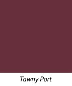
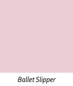
REDS: From the red family are Grenadine, Tawny Port and Ballet Slipper

1. Grenadine is a very bold red that is sure to catch everyone’s attention. Shades of red seemed to take center stage for many designers at New York Fashion Week as well as London’s Fashion Week. So, get ready to see some very bold reds in stores this fall.
2. Tawny Port is the new burgundy for this fall. It is much deeper and richer than what we have seen past seasons.
3. Ballet Slipper makes me so happy! I love pink and especially soft rosy pinks like this one. I am also glad to know that the pinks in my closet are still good for this season. This color was worn head to toe at New York fashion week but it can also be worn with any of the colors in this palette.
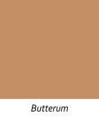
FALL CLASSICS: Your classic colors for this season are Neutral Gray, Navy and Butterum.


4. Navy Peony is just that..navy, but a little more blue. It is recommended as a neutral and can replace your black for the season. It is considered an anchor color for the Fall 2017 palette by the Pantone Institute and looks amazing paired with any of the colors in the palette.
5. Neutral Gray is also a go to neutral for this fall season. Each season there is some shade of gray that takes a spot in the chosen color palette. Gray is also considered an anchoring shade by the Pantone Institute but is great worn monochromatically.
6. Butterum is a warm peachy brown that makes you think of rum! It is the perfect shade of toasty brown! This color will be seen in clothing but also in outerwear, handbags and accessories.
MIX AND MATCH: These are the additional colors that you will be seeing this fall season.
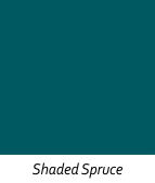

7. Shaded Spruce is such a rich shade of green that exudes much beauty! I can’t ever find the words to describe how amazing this color is. It was shown as a head to toe color at New York Fashion Week and was surprisingly stunning!
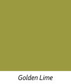
8. Golden Lime is a yellow-green color with golden undertones. It is described as “earth tones with a twist” and is a great accent color with your fall classics.
9. Marina is a cool blue instead of a warm blue and is the only cool color in the palette. This helps to perk up the warm tones and bring them to life.
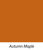
10. Autumn Maple is THE color that makes me think of everything fall! It is best described as a golden reddish brown and reminds me of pumpkins! This warm and toasty color is something you probably already have in your closet!
I got super excited when I got my Zara email with their Pre-Fall Collection. You should check it out because they used all the colors in this palette and they really bring them to life! I will be posting some of my favorites from this collection very soon and it is sure to get you pumped for fall. Honestly, you can start wearing some of it now!


Comments are closed.